展示
核心想法
運用 checkbox 的勾選來模擬漢堡 menu 開關
以下 mobile 畫面為 Chorme iphone 6/7/8 畫面
mobile 部分
網頁架構以 mobile 優先,之後再使用 media 製作 PC 版本
HTML 架構和基本 CSS
label 為漢堡選單的漢堡部分
我們可以使用 label 的 for 功能來配合 checkbox
當 label 被點選後 checkbox 就會被勾選
1 | <header> |
2 | <input type="checkbox" name="menu-switcher" id="menu-switcher" /> |
3 | <label for="menu-switcher" class="hamburger"> |
4 | <div class="hamburger-line"></div> |
5 | </label> |
6 | <h1 class="logo"> |
7 | <a href="#">menu</a> |
8 | </h1> |
9 | <ul class="menu"> |
10 | <li><a href="">link</a></li> |
11 | <li><a href="">link</a></li> |
12 | <li><a href="">link</a></li> |
13 | <li><a href="">link</a></li> |
14 | </ul> |
15 | </header> |
CSS reset 部分使用 meyerweb 網站
一般 CSS
1 | * { |
2 | -moz-box-sizing: border-box; |
3 | -webkit-box-sizing: border-box; |
4 | box-sizing: border-box; |
5 | } |
6 | |
7 | header { |
8 | background-color: #66ffff; |
9 | position: relative; |
10 | } |
11 | |
12 | .logo a { |
13 | background-image: url("../images/instagram-highlight-stories-small.png"); |
14 | background-repeat: no-repeat; |
15 | overflow: hidden; |
16 | text-indent: 101%; |
17 | white-space: nowrap; |
18 | display: block; |
19 | width: 64px; |
20 | height: 64px; |
21 | cursor: pointer; |
22 | } |

LOGO 來源 link
漢堡按鈕
將漢堡的區塊製作出來
1 | .hamburger { |
2 | background-color: #000000; |
3 | width: 50px; |
4 | height: 50px; |
5 | position: absolute; |
6 | top: 10px; |
7 | right: 10px; |
8 | display: block; |
9 | } |

再來製作裡面的三條線
三條線運用 box-shadow 製作影分身之術的效果
1 | .hamburger-line { |
2 | width: 40px; |
3 | height: 3px; |
4 | background-color: #ffffff; |
5 | margin: auto; |
6 | position: absolute; |
7 | top: 0; |
8 | left: 0; |
9 | right: 0; |
10 | bottom: 0; |
11 | box-shadow: 0px 10px 0px #ffffff, 0px -10px 0px #ffffff; |
12 | } |

W3C 有另一種寫法可以參考連結
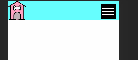
來試試看 checkbox 是否有勾選
目前還算成功
Menu
menu height 使用 100vh 來滿版
並用 position: absolute; 布滿整個版面對齊 header
因為 header 設定position: relactive
設定 z-index 處於最上層
1 | .menu { |
2 | background-color: #000000; |
3 | height: 100vh; |
4 | width: 80%; |
5 | position: absolute; |
6 | top: 0; |
7 | left: 0; |
8 | z-index: 100; |
9 | } |

Menu 選項方面比較簡單,普通的設定沒有特殊方法
1 | .menu li a { |
2 | display: block; |
3 | padding: 15px; |
4 | margin: 0px 20px 10px; |
5 | color: #ffffff; |
6 | text-decoration: none; |
7 | text-transform: uppercase; |
8 | font-size: 20px; |
9 | text-align: center; |
10 | border-bottom: 3px solid #ffffff; |
11 | } |

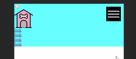
收放選單動畫
選單初始狀態應該是收起來的
因此我們用 transform 來設定
1 | .menu { |
2 | transform: translateX(-100%); |
3 | } |

再來是重頭戲: 收放動畫
想法為 : 當 checkbox ckecked 時,menu transform 到原來的地方
checkbox 其實可以應用很多地方,尤其是有 if else 概念的時候,像是滑動按鈕
.menu 加上 transition 看起來比較好看
1 | .menu { |
2 | transform: translateX(-100%); |
3 | transition: 0.5s; /* new */ |
4 | } |
5 | |
6 | #menu-switcher:checked ~ .menu { |
7 | transform: translateX(0%); |
8 | } |
隱藏畫面上的 checkbox
最後一步隱藏 checkbox
1 | #menu-switcher { |
2 | display: none; |
3 | } |

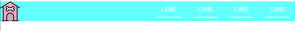
mobile 大功告成,但是還有 PC 版本才算完成
PC 部分
選單隱藏
先把 hamburger 選單隱藏
1 | @media screen and (min-width: 768px) { |
2 | .hamburger { |
3 | display: none; |
4 | } |
5 | } |
menu 部分
header 使用 flex 來排版
.menu transform 回原來的地方,width 和 height 設定 auto 回正常的值,裡面的 item 也用 flex 排版
1 | @media screen and (min-width: 768px) { |
2 | .hamburger { |
3 | display: none; |
4 | } |
5 | header { |
6 | display: flex; |
7 | justify-content: space-between; |
8 | } |
9 | .menu { |
10 | transform: translateX(0%); |
11 | height: auto; |
12 | width: auto; |
13 | display: flex; |
14 | position: relative; |
15 | background-color: transparent; |
16 | } |
17 | } |
完成!!!!!
完整 CSS
1 | * { |
2 | -moz-box-sizing: border-box; |
3 | -webkit-box-sizing: border-box; |
4 | box-sizing: border-box; |
5 | } |
6 | |
7 | header { |
8 | background-color: #66ffff; |
9 | position: relative; |
10 | } |
11 | |
12 | .logo a { |
13 | background-image: url("../images/instagram-highlight-stories-small.png"); |
14 | background-repeat: no-repeat; |
15 | overflow: hidden; |
16 | text-indent: 101%; |
17 | white-space: nowrap; |
18 | display: block; |
19 | width: 64px; |
20 | height: 64px; |
21 | cursor: pointer; |
22 | } |
23 | |
24 | .hamburger { |
25 | background-color: #000000; |
26 | width: 50px; |
27 | height: 50px; |
28 | position: absolute; |
29 | top: 10px; |
30 | right: 10px; |
31 | display: block; |
32 | } |
33 | |
34 | .hamburger-line { |
35 | width: 40px; |
36 | height: 3px; |
37 | background-color: #ffffff; |
38 | margin: auto; |
39 | position: absolute; |
40 | top: 0; |
41 | left: 0; |
42 | right: 0; |
43 | bottom: 0; |
44 | box-shadow: 0px 10px 0px #ffffff, 0px -10px 0px #ffffff; |
45 | } |
46 | |
47 | .menu { |
48 | background-color: #000000; |
49 | height: 100vh; |
50 | width: 80%; |
51 | position: absolute; |
52 | top: 0; |
53 | left: 0; |
54 | transform: translateX(-100%); |
55 | transition: 0.5s; |
56 | z-index: 100; |
57 | } |
58 | |
59 | .menu li a { |
60 | display: block; |
61 | padding: 15px; |
62 | margin: 0px 20px 10px; |
63 | color: #ffffff; |
64 | text-decoration: none; |
65 | text-transform: uppercase; |
66 | font-size: 20px; |
67 | text-align: center; |
68 | border-bottom: 3px solid #ffffff; |
69 | } |
70 | |
71 | #menu-switcher { |
72 | display: none; |
73 | } |
74 | |
75 | #menu-switcher:checked ~ .menu { |
76 | transform: translateX(0%); |
77 | } |
78 | |
79 | @media screen and (min-width: 768px) { |
80 | .hamburger { |
81 | display: none; |
82 | } |
83 | header { |
84 | display: flex; |
85 | justify-content: space-between; |
86 | } |
87 | .menu { |
88 | transform: translateX(0%); |
89 | height: auto; |
90 | width: auto; |
91 | display: flex; |
92 | position: relative; |
93 | background-color: transparent; |
94 | } |
95 | } |